
 Brian DeLuca
 1. Know Your Audience
Before you begin designing your dashboard, you need to understand who will be using it and what their needs are.
Ask yourself:
Are they executives who need high-level KPIs?
Are they analysts who need to drill down into granular details?
Do they have technical expertise, or are they less familiar with data analysis?
Tailoring your dashboard to your audience ensures that the insights you provide will be relevant and accessible. For instance, a CEO might only need a simple overview of sales performance, while a CFO might require a financial analytics Power BI dashboard with more detailed breakdowns and interactive elements.
2. Focus on the Key Metrics (KPI)
Cluttering a dashboard with too many visuals or irrelevant data can overwhelm users. To avoid this, focus on the key performance indicators (KPIs) that align with the objectives of the business or department.
Select visuals that highlight the most critical data points, such as:
Sales growth over time
Customer satisfaction ratings
Marketing campaign performance
Remember, less is often more when it comes to dashboards. Keep your metrics concise, and ensure they answer the specific questions your users are asking.
3. Use Consistent Colors and Fonts
A visually consistent dashboard improves readability and user experience. Stick to a unified color palette that aligns with your organization’s branding or theme. Avoid using too many colors, as this can make the dashboard appear cluttered or confusing. Power BI offers custom themes that will allow you to create consistency across all your reports.
Additionally, be mindful of font choices:

Use large, bold fonts for titles and important figures like total revenue or net profit.

Use standard fonts for details and smaller text to maintain a clean, professional look.
Content delivery tools such as The Reporting Hub take a step further by enabling you to create dedicated, custom-branded Power BI dashboard delivery portals for internal and external users for a team or business unit.
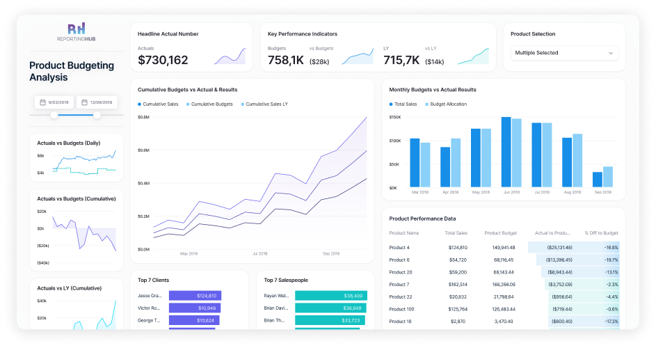
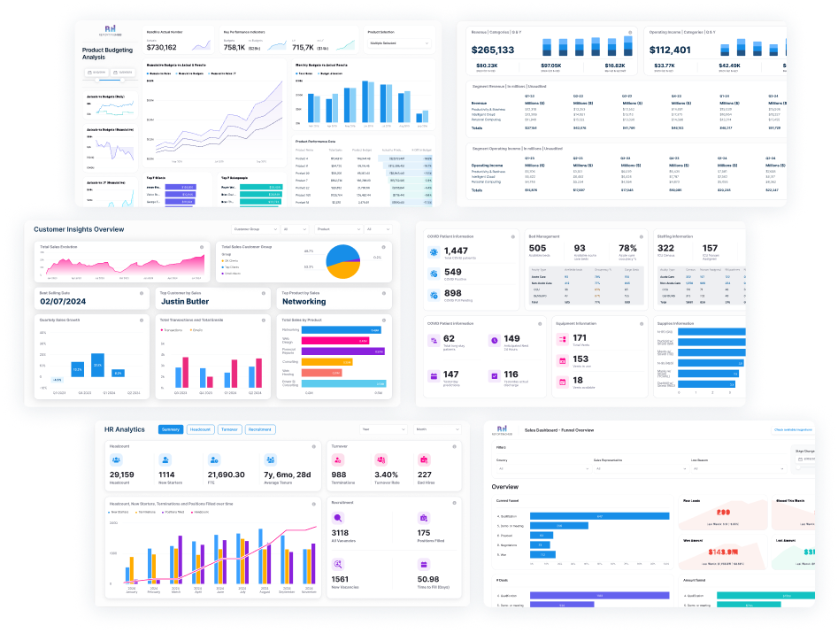
4. Choose the Right Visuals for Your Data
Power BI offers a wide range of visualizations, from bar charts and line graphs to more advanced visuals like treemaps and waterfalls. However, it’s essential to choose the visual that best represents the data you’re showcasing.
Here are a few guidelines:
Bar/Column charts: Great for comparing categories.
Line charts: Ideal for showing trends over time.
Pie/Donut charts: Best used when showcasing part-to-whole relationships, though avoid overuse.
Maps: Perfect for geographical data, like sales by region.
Cards: Effective for highlighting single metrics such as total sales or net profit.
Make sure that the visuals you use are easy to interpret at a glance and support the overall narrative of your dashboard.
5. Leverage Hierarchies and Drill-Through Capabilities
One of Power BI’s strengths is its interactivity. You can enable drill-downs, filters, and tooltips that allow users to explore the data behind high-level visuals. This functionality is especially useful for more technical users or analysts who want to dive deeper into specific metrics.
For example, you can allow users to click on a sales chart by region to view a breakdown by individual stores. Or, set up tooltips to show additional insights when hovering over a specific data point, enhancing the interactive experience without adding visual clutter.
6. Ensure Mobile-Friendliness
As mobile usage continues to grow, it’s essential to ensure that your Power BI dashboards are mobile-friendly. Power BI includes a built-in mobile view editor, allowing you to create a layout that is optimized for smaller screens.

When designing for mobile:

Focus on the most critical metrics and visuals.

Avoid detailed, complex visuals that may be hard to read on smaller devices.

Ensure buttons and interactive elements are easily clickable on touchscreens.
Ensure buttons and interactive elements are easily clickable on touchscreens.
7. Use White Space Effectively
White space isn’t wasted space—it’s an important design element that helps make your dashboard more readable and visually appealing. Too many charts, colors, and text crammed into one space can overwhelm users. Use white space to create a clean, organized look that makes the data easier to digest.
By giving your visuals room to breathe, you also help direct users’ attention to the most critical areas of your dashboard, such as KPIs or trends.
8. Utilize Filters and Slicers
Power BI’s filtering and slicer options make your dashboard more interactive by providing users with the ability to customize the data they view. Adding slicers for categories such as date, region, or product line allows users to drill down into the metrics that matter most to them.

For example, if your dashboard displays sales data, a date slicer lets users easily switch between daily, weekly, or yearly views without overwhelming the report with too many charts.
9. Performance Optimization: Speed Matters
An engaging, well-designed dashboard is of no use if it takes forever to load.
To ensure optimal performance:

Optimize your data model by removing unnecessary columns and rows.

Use aggregated data where possible to reduce the load on your system.

Limit the number of visuals on a single page, as each visual query can slow down the dashboard.
Power BI also has features to help you monitor and improve performance, like the Performance Analyzer tool, which identifies slow-running visuals.
10. Test, Iterate, and Get Feedback
Finally, the key to a successful Power BI dashboard is continuous improvement. Share your dashboard with stakeholders and gather feedback. Is the layout intuitive? Do the visuals effectively communicate the insights? Is anything unclear or overly complicated?

After gathering feedback, iterate on your design, making improvements where necessary. Dashboards are not a “set it and forget it” tool—constant refinement ensures they remain valuable over time.
The Bottom Line
Designing an effective Power BI dashboard requires a balance between aesthetics and functionality. By following these best practices—understanding your audience, focusing on key metrics, choosing the right visuals, and optimizing for performance—you can create dashboards that not only look good but also empower your users with actionable insights.
With a thoughtful design approach, your Power BI dashboards can become invaluable tools for decision-making and business success.